Friday, 27 May 2016

Bringing a product back to life through good design

It is interesting to see how good design, especially that which focuses on aesthetics, can revitalize a somewhat dead product on the market. I came across a case study while reading of the books which I read as part of the literature review. It revolves around the re-branding of the product CleaWhite - a skin-whitening treatment provided by AVON China.

The Asian beauty culture, especially that involving China and Japan, gives importance to the skin. From a very young age, women are obsessed with having a radiant glow to their skin, and rather than focusing on making up the eyes or the lips, their main focus is the skin. But why create a whitening products for the skin? The answer is simple. When I was young, I was obsessed with a Disney film called 'Mulan'; there was a particular scene in the film where the young girl was being set up for marriage. As part of their culture, it was traditional for the young girls' faces to be painted porcelain white before being presented to the matchmaker. The need for a whitening product for the skin goes back to tradition, not for the purposes of being set up for marriage, but rather the meaning behind it: radiance and vitality - qualities which were synonymous with brides, and which Asian women nowadays are obsessed with.

AVON China had an existing brand which was dated, and unfortunately not being noticed in the Asian beauty industry. As the whitening products market was expanding, a couple of years before 2010 AVON China decided to re-brand the product to reflect and appeal to women who gave importance to three factors: spontaneity, vitality and sophistication

CleaWhite was redesigned and re-branded as a product which offers beautiful skin 'that glows with translucency'. The design company Desgrippes Gobe enhanced the shape of the bottle, and chose to encase the product in a pearlized bottle material, which represents outer light, and the readiance users fell after using CleaWhite. Rather than opting for a harsh rectangular exterior for the bottle, the designers went for a shape consisting of a rectangular pattern with a rounded edge thus giving the product a modern feel. The brand identity was designed so as to highlight the radiance and shine that the brand promises. 


Wednesday, 25 May 2016

MAC's VIBE TRIBE Collection Controversy

Although it is not pleasant for me to say, over the past couple of weeks, MAC has been at the forefront of news in the beauty industry due to the controversy around the company's new summer collection - VIBE TRIBE.


Apart from being an immensely aesthetically pleasing collection in my opinion - starting from the colour shades of the lipsticks and eye-shadows, to the beautifully-designed brush cases and product exterior, it never crossed my mind to think about the effect the visuals representing the collection would have on those who might relate to the word 'tribe' on an emotional level. More so since MAC's motto is All ages. All races. All sexes. 

MAC fans who took offence from this took to social media to criticize the company and accuse them of cultural appropriation: 

"I'm really grossed out by the fact that they'll be benefiting from Native designs and 'vibes,' and I don't imagine any of the proceeds will be going to any of the First Nations, and I'd be surprised if there were any Native models in their ad campaigns," a user wrote. "My personal history is tribal, and it's not just a cute design for me, it's my culture. And my culture is dying, my people are dying, and it's because of a history of mass genocide and forced sterilization and plagues and poverty and broken treaties — and it actually hurts to imagine that someday, the word 'tribe' might live on on the faceplate of some MAC cosmetic, long after the last native speaker of the Nimiípuu is gone."

The company on the other hand stated that the main inspirations behind the collection were art, outdoor music festivals, and the colours of the desert. Moreover, the company denied any connection between the VIBE TRIBE collection and Native American cultures. 

My opinion on this controversy: had I not read about it on the internet, I would have never thought that there would be anyone who would take offence from such a make-up collection. It could be that since it does not affect me directly, I find no objection since upon looking at the packaging of the products as well as the advertising campaigns and visuals to promote this collection, there is nothing offensive about them. Another reason for me being oblivious to the potential occurrence of this situation is the fact that I (and I dare say the majority of people) am used to references to tribal cultures being made in a similar manner to how they are portrayed in MAC's promotional campaign.

This goes to show and confirm what I have written in my literature review with regards to people connecting with products on an emotional level. Even though ideally the connection is a positive one, and one with the aim of attracting customers and subconsciously giving them a reason to purchase a particular product, the connection could turn into a negative one. The consequences of this could be similar to what happened to MAC: being called out on the internet. Unfortunately it could also cause a loyal fan to distance him/herself from the company, or even drive away a potential customer.

This is a pure example of how a company can lose a loyal customer as quickly as it can gain one. 

Tuesday, 24 May 2016

Aesthetically Obsessed?

I came across the following website while conducting research;

http://www.byrdie.co.uk/prettiest-beauty-product-packaging/slide19

The title alone - 15 Beauty Products for the Aesthetically Obsessed - already implies that there are people who would buy products just for the sake of having something pretty to look at, or because 'it matches their style'.

The opening lines to the article are as follows:

"Aesthetics are very important to me—I want my beauty products to look as good on my bathroom shelf as they do applied to my face. Either subconsciously or with an artfully arranged Instagram snap in mind—it’s usually the latter—I find myself purchasing products that best match my style."

This made me think; due to my job I am already fairly certain that aesthetics do influence the client's purchasing decisions since I have seen it happen on countless occasions. But to go to the extent of buying a product simply because 'it looks nice' is a bit over the top in my opinion. Is the design of a package that influential? What sort of connection is created between the user and the product? Would you be willing to purchase a product which you know you can buy for a lower price, but opt for the higher priced option because of what it looks like? It would take a lot more than that for me to do so. Primarily, it would have to be literally 'love at first sight' in terms of the package's colour, the shape, and the style. Secondly, it would have to be something which I don't currently own, and would have to know that the product actually works, more so if I would be potentially spending a hefty sum of money. Apparently, I am one of the few who analyze purchases in this way. To each his own! 

The literature review I carried out a couple of weeks ago has already answered a couple of the questions I mentioned in the previous paragraph. There could be a number of influential factors, such as the choice of colour, what the form and the materials of the product represent in terms of social class, etc. Unfortunately there is no correct answer as even though studies have been carried out, each individual person has a different understanding as to what is aesthetically pleasing. As we say in Maltese, 'għalhekk il-baqra tinbiegħ kollha!' 

Monday, 23 May 2016

Why The Beauty Industry Can Get Away With Charging A Fortune For Make-up

Link to webpage:
http://www.alternet.org/story/148140/the_cosmetics_racket%3A_why_the_beauty_industry_can_get_away_with_charging_a_fortune_for_makeup

This article discusses the issue of pricing, and whether beauty products and the ingredients which make up the actual product cost as high as they are priced. 

Even though my critical study focuses on the aesthetics of make-up packaging and how this influences consumer purchasing decisions, one can't deny that pricing is also a determining factor. I agree with what the article states, that is, that for most of the high-end products with prices starting from $90, clients would be paying for the brand - packaging, and marketing and advertising schemes - rather than for the ingredients within the product itself. 

This shows that clients are 'tricked' unintentionally by elaborate packaging and claims about the product which could be true but somewhat exaggerated in order to attract customers, and ultimately instill a sense of want for the product in order to satisfy their needs or possible insecurities.

"Cosmetic companies are acutely aware of the anxieties consumers have about aging and 
other skin concerns. They know what consumers want to hear, and they claim exactly that, even 
when it isn't true. Hope springs eternal, and a lot of people are willing to pay a lot more than
 is necessary for a product that promises to fix whatever bothers them."

- Paula Begoun, make-up artist, cosmetic expert and author

Another factor which is also influential is psychology. Cosmetics clients tend to believe that higher pricing means better quality, and thus that instills a feeling in the clients which makes them feel good about themselves, and ranks them higher within the social scale. 

The following is a link to a youtube video in which a make-up artist find dupes for high end products from the high street in order to create the same look. She applies the high street products to one half of her face, and the high end products to the other half. Shes uses the same techniques for both sides of her face, and leaves the make-up on for most of the day. At the end of the day she analyses both sides of her face in terms of the make-up's staying power, long-weariness and colour intensity. The results are quite interesting; sometimes the difference is so minute that it wouldn't even be worth paying a large amount of money for high end products when spending a quarter of the money on make-up from the high street will still get the job done. This goes to show that the majority of the price of high end products comprises packaging, and other brand advertising schemes. Elaborate packaging is mostly the sole reason for client's purchasing decision in these cases. 

Link to youtube video: 
https://www.youtube.com/watch?v=vDkMfdg-1as


Friday, 30 January 2015

Sustainable Architecture

Sustainability is defined as the quality of not being harmful to the environment or depleting natural resources, and thereby supporting long-term ecological balance. 

One of the most waste-generating industries is that of architecture. Recent technologies have allowed designers and architects to adopt sustainable methods when design buildings. The following are examples of how sustainability is being applied to architecture. 


Manitoba Hydro Place

Manitoba Hydro Place is the headquarters building of Manitoba Hydro, the electric power and natural gas utility in the province of Manitoba, Canada. The building's bio-climatic, energy-efficient design features a 115 m tall solar chimney, a geo-thermal heat system, natural air ventilation which provides 100% fresh air all year round, and a one-meter-wide double exterior wall with computer-controlled motorized vents that adjust the building's exterior skin throughout the day and evening. Together, the various elements of the design enable a 70% energy savings over most other buildings. 

1ajs january 2009.jpg

Namba Parks

Namba Parks is an office and shopping complex located in Osaka, Japan. Built in a former baseball stadium (thus reducing the use of construction materials and waste), it is considered to be one of the most Green areas of Osaka. It consists of ecological features such as waterfalls, trees, lawns and ponds. This makes a difference in comparison to the urban environment surrounding the area.


Condé Nast Building
The Condé Nast Building, officially known as 4 Times Square, is a modern skyscraper in Times Square in Manhattan, New York City. 4 Times Square is one of the most important examples of green design in skyscrapers in the United States. Environmentally friendly gas-fired absorption chillers, along with a high-performing insulating and shading curtain wall, ensure that the building does not need to be heated or cooled for the majority of the year. The building also uses solar technology.


Salesforce Tower


Formerly known as the Transbay Tower, the Salesforce Tower is a 326 m skyscraper under construction in San Francisco. It is a highly sustainable in design, with a rooftop park to absorb CO2, wind turbines and solar panels to generate electricity, 100% natural air ventilation and the ability to capture and recycle rainwater. 

Transbay Tower Most Recent Proposal.jpg


References

Achieving Climate Neutrality Through Energy Conservation and Renewable Energy. (2015). [online] Available at: http://www.laccdbuildsgreen.org/docs/energytoolkit/Presentations&Papers/Neutrality_Through_Conservation_and_Renewable_Energy.pdf [Accessed 30 Jan. 2015].

Wikipedia, (2015). Condé Nast Building. [online] Available at: http://en.wikipedia.org/wiki/Cond%C3%A9_Nast_Building [Accessed 30 Jan. 2015].

Wikipedia, (2015). Manitoba Hydro Place. [online] Available at: http://en.wikipedia.org/wiki/Manitoba_Hydro_Place [Accessed 30 Jan. 2015].

Wikipedia, (2015). Namba Parks. [online] Available at: http://en.wikipedia.org/wiki/Namba_Parks [Accessed 30 Jan. 2015].

Wikipedia, (2015). Salesforce Tower. [online] Available at: http://en.wikipedia.org/wiki/Salesforce_Tower [Accessed 30 Jan. 2015].

Wikipedia, (2015). Sustainable design. [online] Available at: http://en.wikipedia.org/wiki/Sustainable_design#Sustainable_architecture [Accessed 30 Jan. 2015].

Wednesday, 28 January 2015

Ergonomic and Universal Design

We generally do not notice when something is designed properly since it functions as it is supposed to, but we do notice bad design. This is where ergonomics comes in. 

Ergonomics is the study of the human body and how it interacts with its surrounding environment, be it through making use of a product or a system. Even more so today with the advances in technology, it would be quite risky for the company's credibility to produce something which does not compliment the physical needs of the consumer.

Ergonomics has two major objectives: to enhance the effectiveness and efficiency with which work and other activities are carried out, as well as to improve safety, reduce stress and increase comfort. Ergonomically-designed products have to be given the utmost importance especially in the work place as this will increase the workers' productivity, increase efficiency and in general, make the work environment a comfortable place to work in. 

Vertebra armchair - Emilio Ambasz
It is said to be the first automatically adjustable office chair,
designed to respond and adapt to the movements
of the user's body and provide comfort and support

Another aspect which goes hand in hand with ergonomic design is universal or inclusive design.

Universal design refers to the importance of products which cater for the needs of everyone. This aim behind this type of design is to integrate everyone irrespective of physical ability, age, mental capacity, or any other situation. 

Universal design aims to accommodate people with special needs, children, the elderly, and others who find themselves outside the parameters of what is normally considered acceptable or average.

Universal Design focuses mainly on creating designs that are functional and usable by everyone, giving importance to accommodating the different needs and abilities of each individual. In order to do this, products designed for a specific purpose must simple to use, easy to understand and able to communicate information easily and effectively. This will lead to the minimization of accidents, while still being ergonomic so as to reduced the amount of physical effort required to perform tasks. 


It is of utmost importance for designers and design companies to incorporate ergonomic and universal design in their design process. it is a responsibility which needs to be taken seriously as it could effect the customers', hopefully in a positive way so as to make life safer and better for everyone, irrespective of the physical situations they may be in. 

References

Ergonomics and Design. (2015). [online] Available at: http://www.iieom.org/ieom2011/pdfs/IEOM130.pdf [Accessed 28 Jan. 2015].

Inclusivedesigntoolkit.com, (2015). What is inclusive design?. [online] Available at: http://www.inclusivedesigntoolkit.com/betterdesign2/whatis/whatis.html#p110 [Accessed 28 Jan. 2015].

Metmuseum.org, (2015). Emilio Ambasz and Giancarlo Piretti: "Vertebra" armchair (1989.48) | Heilbrunn Timeline of Art History | The Metropolitan Museum of Art. [online] Available at: http://www.metmuseum.org/toah/works-of-art/1989.48 [Accessed 28 Jan. 2015].

nibusinessinfo.co.uk, (2015). [online] Available at: https://www.nibusinessinfo.co.uk/content/importance-ergonomics [Accessed 28 Jan. 2015].

Monday, 26 January 2015

Postmodernism

A style that was in vogue between the 1970s and the 1990s was Postmodernism. Evolving as a movement against the International Style, this style wanted to rid the world of the rigidity, clarity and simplicity of that style in favour of a more complex and artistic one. 

The Postmodernists often referred to the past for inspiration, and incorporated a mixture of styles, bright colours and decoration into their designs. The style brought about a sense of freedom in both art and design, often with witty underlying meanings. It was the time of questioning and contrasting. For example, precious materials were combined with cheap ones; products designed in a minimalist way, but also elaborately ornamented. 

According to modernists, less is more. Postmodernists believed that less is a bore. They believed that we needed as much information and references as possible to determine our own individual conclusion. They were in favour of collages and repetition of the same patterns, since they believed that they were more interesting. Postmodernists wanted to challenge the audience and force them to ask questions. In architecture, buildings were rid of their blandness in favour of more artistic and cultural designs, For example, the Las Vegas strip is a pure example of this. In just one stretch of space, one can find different styles and cultures which create a fun and interesting atmosphere. 


Postmodernism also had its critics. Some objected that the style was unnecessarily ornamented, and that there was too much of an obsession with recycling the past in order to create something new. Despite this, the Postmodernist movement was effective in getting the world to question why things are the way they are, and this factor s still influential in today's world. 

Prominent designers and groups at the time include the Memphis Group, Studio Alchymia, Michael Graves, Ettore Sottsass and Aldo Rossi.

Juicy Salif lemon juicer by Philippe Starck, Designed for Alessi
Juicy Salif lemon juicer by Philippe Starck

Kettle designed by Michael Graves in 1984-85
Kettle designed by Michael Graves

Carlton bookcase by Ettore Sottsass

Consumer's Rest Lounge Chair by Frank Schreiner

References

Dezeen, (2011). Postmodernism: Style and Subversion 1970-1990 at the V&A - Dezeen. [online] Available at: http://www.dezeen.com/2011/09/26/postmodernism-style-and-subversion-1970-1990-at-the-va/ [Accessed 26 Jan. 2015].

Dhub.org, (2015). Postmodernism: the movement we love to hate | D*Hub. [online] Available at: http://www.dhub.org/postmodernism-the-movement-we-love-to-hate/ [Accessed 26 Jan. 2015].

Kent, S. (2015). Postmodernism: Style and Subversion 1970-1990, V&A | Visual arts reviews, news & interviews | The Arts Desk. [online] Theartsdesk.com. Available at: http://www.theartsdesk.com/visual-arts/postmodernism-style-and-subversion-1970-1990-va [Accessed 26 Jan. 2015].

Vam.ac.uk, (2015). Postmodernism - Victoria and Albert Museum. [online] Available at: http://www.vam.ac.uk/content/articles/p/postmodernism/ [Accessed 26 Jan. 2015].

Vam.ac.uk, (2015). Postmodernism - Victoria and Albert Museum. [online] Available at: http://www.vam.ac.uk/content/articles/p/postmodernism/ [Accessed 26 Jan. 2015].

Friday, 23 January 2015

The influence of Pop Design in the furniture industry

The term 'Pop Design' was coined in the 1950s, and as a movement it started off in London as an Independent Group. Due to the negative impact of the war, designers were questioning the role of design in society. Contrary to the belief in the 1930s, functionality in design was questioned. Movements against functionalism emerged; designers wanted to treat society as though it were art itself, rather than classifying art as a separate entity. The designs of the past were regarded to be inhuman, cold and outdated. Influenced by the hippies, pop music and the 'flower power', the style of the day was bombarded with bold, symbolic colours and the use of easily-available material such as plastics and PVC. 

One of the industries which were highly influenced by the Pop movement was furniture design. As shall be seen in an example below, designers took a subject that was in vogue at the time and used that as a starting point for their designs. More-over, they used these designs as a means of commenting on what was going on in society. For example, the Bocca sofa or Marilyn sofa produced by Studio 65 in 1972. This is a good example of how pop design was influenced by what was going on in the Pop Art movements as well as the highlight of the day: Marilyn Monroe. Just like Andy Warhol's silk screen prints of Marilyn Monroe, the sofa is so iconic that it is easily identifiable with the movie star herself, and reflects her influence at the time. The sofa in itself is quite simple in concept: an over-sized shape of bold, red lips in a seemingly cartoonish manner, which still functions perfectly as a sofa despite its structure. 

Studio 65: Heller Marilyn Bocca Lip Sofa
Bocca sofa - Studio 65

Side view of the Bocca sofa - Studio 65

Another characteristic which is synonymous with Pop Design is the use of bold colours in conjunction with minimalistic designs, specifically done so as to catch the viewers' attention. An example of this is the Malitte lounge furniture by Roberto Sebastian. At first glance, the piece seems to be a pointless mass of green blocks with a yellow circle in the centre. What is interesting is the fact that automatically, the viewer's eyes seem to turn towards the yellow in the centre, which in turn evokes a sense of curiosity to learn more about the piece. Despite this, the viewer is given the opportunity to freely interpret the piece.

Malitte lounge furniture - Roberto Sebastian

As mentioned before, Pop designs were known for their use of material such as plastic. This can be further seen in the introduction of inflatable furniture. Despite the low durability of the material, this invention seemed to appeal to a younger generation since it could allow the user to travel anywhere and literally take their furniture with them, and thus it became quite popular at the time. Although they proved to be uneconomical and environmentally unhealthy in the long-run, today we can still see the impact of these designs since we are still able to purchase similar items such as air mattresses and lilos.

Inflatable Lounge Chair
Newspaper advert which shows the promotion of inflatable furniture

'Aerospace' collection - Quasar Khanh

Pop furniture designs seemed to have been a highlight of the Pop Design movement since it reflected the societal influences on people's lifestyle. Through bold, symbolic colours and witty yet effective designs, it retranslated the materialistic mentaility of the 1960s. 

References

Bbc.co.uk, (2015). BBC - Homes - Design - 1960s. [online] Available at: http://www.bbc.co.uk/homes/design/period_1960s.shtml [Accessed 23 Jan. 2015].

Design Addict, (2015). Quasar Khanh, pioneer of inflatable furniture. [online] Available at: http://www.designaddict.com/blog/2012/03/15/Quasar-Khanh-pioneer-inflatable-furniture [Accessed 23 Jan. 2015].

Theartstory.org, (2015). Pop Art Movement, Artists and Major Works | The Art Story. [online] Available at: http://www.theartstory.org/movement-pop-art.htm [Accessed 23 Jan. 2015].

Voicesofeastanglia.com, (2015). Blow Up - Quasar Khanh’s Inflatable Furniture - Voices of East Anglia. [online] Available at: http://www.voicesofeastanglia.com/2013/07/quasar-khanh-inflatable-furniture.html [Accessed 23 Jan. 2015].

Saturday, 17 January 2015

Scandinavian Design - the philosophy, characteristics and inspiration behind the movement

Scandinavian Design refers to the movement that emerged in Denmark, Norway, Sweden, Finland and Iceland. Although it was relatively unknown to the rest of Europe and the United States of America, Scandinavian Design in itself had been established since the early 1930s. Prominent designers of the movement include Alvar Aalto, Arne Jacobsen, Verner Panton and Poul Henningsen.

Europe in the 1930s

Early 20th Century Europe was dominated by the International Style - one whose focus was primarily on architecture. Sleek lines and geometric shapes were the order of the day. The main aim of architects such as Le Corbusier, Mies van der Rohe and Walter Gropius was to come up with design that were not excessively ornamented, modern and functional. This was aided by the advance in technology, which also helped to bring about experimentation with new materials such as steel, iron, glass and concrete. Prominent designers of the International Style include Charles Rennie Mackintosh, Eileen Gray, Alvar Aalto and Eero Saarinen. The latter two designers were Finnish, thus having their roots in the International Style was what partially influenced them in their designs as the Scandinavian Design movement further developed. 

Back to Scandinavia Design 

The term 'Scandinavian Design' originated from a design show that traveled the United States of America and Canada from 1954 to 1957. The exhibit featured works by native Scandinavian designers, and through it, the meaning behind the term 'Scandinavian Design' was established: simple designs with a touch of flair and beauty, primarily inspired by nature and the northern climate, with a strong emphasis on making the same designs available to everyone irrelevant of their social standing.  

'Enhancing and facilitating daily life through aesthetically pleasing objects and making them accessible to each and every person.'

The phrase above sums up what essentially is the philosophy behind Scandinavian Design. This is due to several reasons, the first being the geographical restrictions of the Scandinavian countries in themselves. The rough climate and cold winters forced the people to focus on making their homes comfortable, warm and above everything else, livable. That is the primary reason why most of the notable works of Scandinavian design revolve around interiors: furniture, lighting and textiles for example. In their work, designers focused on practicality. They achieved this through simple lines and no excessive decoration (just like the designs of the International Style). 

Scandinavian countries became industrialized relatively late in comparison to the rest of the world. This enabled them to preserve traditional crafts fairly longer. The element of survival also plays an important roles in Scandinavian countries. Due to their limited natural resources, they focused more on function and practicality in order to survive. Being surrounded by nature the majority of the time, Scandinavian natives developed a sense of respect for what is around them. This helped them in making the most efficient use out of their limited resources, with natural material such as wood, clay, leather, linen, wool being used for the construction of various items. Nature was also a source of inspiration for many designers, one of which being Alvar Aalto, who designed the famous Savoy Vase (also known as the Aalto Vase). The vase’s unusual shape is said to be taken from the undulating shorelines of Finland’s thousands of lakes. Another reference to nature can be seen in the colour palette opted by the designers; most of the time consisting of lighter, softer, pale colours. In this case we can see a contrast between Scandinavian Design and the International Style, the latter being considered as too cold (due to the use of material such as steel and concrete).

The Aalto Vase - designed by Alvar Aalto 

Finland's thousands of lakes, which served as
an inspiration for the design of the Aalto Vase

The period after the war was hard for the most industrialized and wealthy countries of the time, let alone those limited and lacking in resources. This period highlighted an essential part of Scandinavian Design: making designs that were accessible to all. This is the primary reason why this movement came to be known also for its 'democratic design'. More-over, this can be seen later on during the 20th century when Scandinavian countries were introduced to the machine age. Rather than giving in to soul-less mass-produced objects, machines were used to further enhance designs which gave importance primarily to function and accessibility, while also preserving the beauty of the object in itself. 

The following are several examples of notable works from the Scandinavian Design movement: 


Top (left to right):

Artichoke - Poul Henningsen, Painio Chair - Alvor Aalto , Egg Chair - Arne Jacobsen, The Ant Chair - Arne Jacobsen,

PantonChair - Verner Panton

Bottom (left to right):

Chinese Chair - Hans J. Wegner, The Ericofon - Hugo Blomberg and Ralph Lysell, Eva (armchair) - Bruno Mathsson,

Globe Chair - Eero Aarnio, Tulip Chair - Eero Saarinen


References

Anon, (2015). [online] Available at: http://michelangelo.pixel-online.org/files/Manual_of_fine_arts/New%20Manual%2013%20scandinavia.pdf [Accessed 5 Jan. 2015].

Dawson and Clinton, (2014). A Brief History of Scandinavian Design. [online] Available at: http://www.dawson-clinton.com/news/brief-history-scandinavian-design/ [Accessed 5 Jan. 2015].

Eyþórsdóttir, K. (2011). The Story Of Scandinavian Design: Combining Function and Aesthetics - Smashing Magazine. [online] Smashing Magazine. Available at: http://www.smashingmagazine.com/2011/06/13/the-story-of-scandinavian-design-combining-function-and-aesthetics/ [Accessed 5 Jan. 2015].

Fiell, C. and Fiell, P. (2002). Scandinavian design. Köln: Taschen.

McDermott, C. (2007). Design: The Key Concepts. Routledge.

Scandinavia-design.fr, (2015). SCANDINAVIAN DESIGN - brief description and examples. [online] Available at: http://www.scandinavia-design.fr/design-scandinave_en.html [Accessed 5 Jan. 2015].

South Granville: Vancouver Shopping Neighbourhood, (2012). The Alvar Aalto Vase Collection: More than 7 decades modern. [online] Available at: http://www.southgranville.org/the-alvar-aalto-vase-collection-more-than-7-decades-modern/ [Accessed 5 Jan. 2015]. 

The Nordic Movement, (2011). Scandinavian Modern: What's new in Scandinavian furniture design?. [online] Available at: https://lbstadler.wordpress.com/2011/08/06/scandinavian-modern-whats-new-in-scandinavian-furniture-design/ [Accessed 5 Jan. 2015]. 

The Urban Pig, (2013). A Little History of Scandinavian Design. [online] Available at: http://theurbanpig.wordpress.com/2013/04/09/scandinaviandesign/ [Accessed 5 Jan. 2015]. 

Worldguide.eu, (2015). Characteristics of Scandinavian Design & Furniture - Scandinavian Design - Design. [online] Available at: http://www.worldguide.eu/wg/index.php?StoryID=148&ArticleID=23189&ChapterID=2 [Accessed 5 Jan. 2015].

Tuesday, 13 January 2015

Organic Design

A segment of the International Style focuses on what has become known as organic design. Taking inspiration from nature, designers adopted a humanizing approach to design. Their philosophy was based on the belief that there should be harmony between the natural surroundings and human habitats, so much so that they become one. The term organic design was popularized by architect and designer Frank Lloyd Wright. 

Organic design is characterized mainly by the lack of harsh edges; designers who opted for this style used smooth lines and sculptural forms, always keeping in mind the surrounding environment. A holistic approach was taken when designing - not only making sure that the outer area of a building (if taking architecture as an example) was in harmony with its natural surrounding environment, but also that the interior elements flow and fit in with the building in itself, thus creating a relationship between all the elements. 

One of the most prominent architectural masterpieces of the time which reflect what is mentioned above is the house designed by Frank Lloyd Wright himself - Fallingwater. Located in Pennsylvania, the house is built over a waterfall in a natural reserve. It was built specifically in such a way so that the waterfall is not an added feature, but actually integrated as part of the house itself. Keeping in line with the organic and natural theme, the house was located in such a way so as to provided with natural sunlight for most of the day, thus eliminating the unnecessary use of non-renewable energy. The house itself was made from a combination of natural as well as industrial material. If one observes the interiors of the house itself, as can be seen in the images below, one can visualize what is meant by creating a harmony between the natural environment, the building itself and its interior.

Fallingwater - DSC05639.JPG
Fallingwaters - Frank Lloyd Wright (1935)

Fallingwaters - Frank Lloyd Wright (1935)

Organic design principles were adopted not only by architects, but also by designers such as Ray and Charles Eames, Alvar Aalto, Eero Saarinen, Arne Jacobsen and Paul Henningsen. It is worth noting that there is a cross reference to Scandinavian design since the latter four designers mentioned here are Scandinavian by birth. The Scandinavian design movement is known for its designs inspired by nature as well as the extensive use and manipulation of natural material.


Tulip med.jpg
Tulip Chair - Eero Saarinen

Womb Chair and Ottoman - Eero Saarinen


Egg Chair - Arne Jacobsen

Swan Chair - Arne Jacobsen


La Chaise - Ray and Charles Eames


References

ArchDaily, (2015). Architecture Photography: interior2 (60116). [online] Available at: http://www.archdaily.com/60022/ad-classics-fallingwater-frank-lloyd-wright/interior2-5/ [Accessed 13 Jan. 2015].

Fallingwater.org, (2015). Fallingwater | Home. [online] Available at: http://www.fallingwater.org/ [Accessed 13 Jan. 2015].

Interior Design Ideas, (2015). Live in Falling Water, Frank Lloyd Wright’s Masterpiece. [online] Available at: http://www.home-designing.com/2009/10/live-in-falling-water-frank-lloyd-wrights-masterpiece [Accessed 13 Jan. 2015].

Quezi.com, (2009). Quezi » What is organic design?. [online] Available at: http://quezi.com/5264 [Accessed 13 Jan. 2015].

Slideshare.net, (2015). Key Movements in Design. [online] Available at: http://www.slideshare.net/markrotondella/key-movements-in-design [Accessed 13 Jan. 2015].

Saturday, 10 January 2015

Streamline Moderne

Streamline Moderne, or what we refer to as 'Streamlined Design', was a style that emerged and was highly popular in America in the period between the 1930s and 1950s. It is considered to be a style that evolved from the Art Deco style of the 1920s. 

Having said this, certain characteristics show a distinction between the two movements, such as can be seen in the societal and cultural changes taking place during the respective time periods. Designs of the Art Deco movement focused around the use of bold colours, over-the-top ornamentation, geometric shapes and sharp angles. This style could be seen as a reflection of the lavish lifestyle of the Americans in the roaring twenties. On the contrary, the 1930s gave way to the Great Depression, and with it came a change in style. Sharp angles were replaced by clean and minimalist designs, flowing curves, rounded corners and muted colours.

American Streamlined Design at Philbrook Museum: Scooter
Scooter displayed at the Philbrook Museum of Art

Streamlined designs are true to the definition of the word streamlining, which means shaping an object in such a way so as to reduce the amount of resistance it encounters when it travels through a medium. The teardrop shape was found to be the best form for doing this, and thus this shape is generally used as a reference when discussing streamlined designs. 

Technology and the economy were two important factors which highly influenced designers during the time. As mentioned previously, the 1930s brought about the harsh conditions of a national depression; a time when people could not afford to spend as easily as during the 1920s, and rationalizing was the order of the day. Instead of eliminating all the beauty from designs and opting for function, designers wanted to create a visually appealing exterior that would not be too costly, and that is exactly what streamlined designs reflect. Due to the second World War, technology improved and with this came about the manufacture of material such as aluminium, stainless steel and chrome. This proved to be quite useful since these were inexpensive and could be mass produced, and thus a large majority of the designers were manufactured using these materials.

Pencil Sharpener designed by Raymond Loewy (1933)

Streamlining was not only applied to machinery associated with aerodynamics, such as cars, airplanes and trains; but it was also applied to static pieces such as architecture as well as industrial designs of household items such as toasters and radios. The aim behind these designs involved a philosophy which revolved around the view of the people in terms of consumerism. Design of a generally horizontal orientation, made out of sleek, shiny material, and which screamed modern and technological made the product in question more desirable to the consumer. This stems from their need of a source of hope after a harsh period of national crisis.

An example of streamlining in architecture:
Greyhound bus terminal in Cleveland, Ohio

Zephyr digital clock designed by Kem Weber (1934)

Electrolux vacuum cleaner designed by the Lurelle Guild (1937)

An example of streamlining in Maltese architecture:


The image above shows a automobile showroom in Malta which in my opinion is an example of streamlining as applied to architecture. We can see key characteristics associated with Streamline Moderne such as the horizontal orientation, rounded edges and smooth surfaces of the structure. 


References

Answers.com, (2015). Streamline Moderne Architecture: Features and Influences. [online] Available at: http://architecture.answers.com/history/streamline-moderne-architecture-features-and-influences [Accessed 10 Jan. 2015].

Architecture.knoji.com, (2015). Streamlined Design: Modernity in America. [online] Available at: https://architecture.knoji.com/streamlined-design-modernity-in-america/ [Accessed 10 Jan. 2015].

Classconnection.s3.amazonaws.com, (2015). [online] Available at: https://classconnection.s3.amazonaws.com/973/flashcards/2008973/png/131353003886842.png [Accessed 10 Jan. 2015].

Rose, C. (2006). Greyhound bus terminal, Cleveland, Ohio. [image] Available at: http://www.flickr.com/photos/73416633@N00/251476760 [Accessed 10 Jan. 2015].

The Times of Malta, (2012). A true example of Streamline Moderne. [online] Available at: http://www.timesofmalta.com/articles/view/20120906/environment/A-true-example-of-Streamline-Moderne.435799 [Accessed 10 Jan. 2015].

Villarreal, I. (n.d.). Philbrook Museum of Art Features Exhibition American Streamlined Design: The World of Tomorrow. [online] Artdaily.com. Available at: http://artdaily.com/news/44865/Philbrook-Museum-of-Art-Features-Exhibition-American-Streamlined-Design--The-World-of-Tomorrow#.VL2jl0fF-So [Accessed 10 Jan. 2015].

Friday, 9 January 2015

The International Style

The International Style was mainly one which focused on architecture. It developed in Europe and the United States in the 1920s and 1930s, and later it also spread to countries like Finland, Norway and Denmark to create what is now known as the Scandinavian Design movement. The International Style consisted of a large number of architects and designers which include Eileen Gray, Mies van der Rohe, Walter Gropius and Le Corbusier among others.

LC2 and LC3 Grand Confort - Le Crobusier

The style came to be due to a number of reasons. For example, the excessive use of decoration and more-over, a mash-up of decorative elements from different periods and styles of the past which they wanted to eliminate, as well as the development of new technologies which facilitated the use of material such as glass, iron, steel and concrete. The philosophy behind the style was to create rationalist and disciplined designs, ones which expressed the potential of the material used and which created a harmony between technology and function. 

Seagram building in New York -  Ludwig Mies van der Rohe 

The characteristics of designs produced in line with the International Style were said to be cold and soul-less. Rectilinear forms were preferred; glass curtain walls were a must; open interior space; flat surfaces; no sign of ornamentation. High-rise buildings were constructed in a sleek and boxy manner. These qualities gave way to the construction of the first skyscrapers in the United States. 

Many criticized the International Style for the lack of individuality in design. The Style was more adapted towards those who preferred a repetitive style. I personally think that this is true; if I was to be presented with a handful of different images of skyscrapers I wouldn't be able to tell the difference between them all. Apart from certain elements and the personal touch of the architect in question, the designs all look relatively the same.

Mcgraw-Hill building in New York - Raymond Hood

As can be seen from today's America, the style was generally more applied to industrial building rather than houses. Even though this style represented the American symbol of corporate power and outlined the height of the modern movement in the United States and Europe, after a number of years architects and designers wanted to explore the possibility of more innovation and decoration in their designs rather than be constrained by the rigidity and limitation of the International Style. This resulted in the birth of another movement which came to be known as Postmodernism. 

References

Architecture, Landscape, and Urban Design, (2011). International. [online] Available at: http://architecturestyles.org/international/ [Accessed 9 Jan. 2015].

Craven, J. (2015). Picture Dictionary of Modern Architecture. [online] About.com Home. Available at: http://architecture.about.com/od/20thcenturytrends/ig/Modern-Architecture/International-Style.htm [Accessed 9 Jan. 2015].

Encyclopedia Britannica, (2014). International Style | architecture. [online] Available at: http://www.britannica.com/EBchecked/topic/291280/International-Style [Accessed 9 Jan. 2015].

Sunday, 21 December 2014

The characteristics and influences which brought about Art Deco


Art Deco was an international movement which emerged in France in the late 1920s, although the Unites States of America became prominent leaders of the movement. In fact, the style continued to develop further there in the 1930s, at the time of the Great Depression. Derived from the Exposition Internationale des Arts Décoratifs et Industriels Moderne - a world fair which took place in Paris in 1925 - Art Deco is the term used for the style best known for its glamour, modern and extravaganct design, characterized by geometric shapes, symmetry, sleek lines, and the use of new materials such as plastic and chrome. 

The 1920s and 1930s were the years of change in society itself. Due to the introduction of industrial production and the fast-paced rhythm of life brought about by technological advancement, Art Deco was the movement that embraced all these factors and influenced the majority of arts, such as architecture, interior design, fashion and film. 

Art Deco designs took their inspiration from various sources, each distinctive but able to influence the designers of the time. For example, art movements such as Cubism, Fauvism and Futurism led to the adoption of geometric and angular shapes, symmetry and the use of bold colours. The discovery of the tomb of Tutankhamen was also a source of inspiration, as was Art Nouveau. Art Deco designers adopted the nature motifs which are identified with Art Nouveau, but opted to use new material such as chrome, ivory and Bakelite and bold colours such as black instead of soft pastels. The glitz and glamour of early Hollywood was also a source of inspiration, with the use of material such as highly polished wood and glossy black lacquer mixed with satin and furs, and the excessive use of reflective surface such as mirror tiles, glass and metal.

As mentioned before, the 1930s brought about the Great Depression in America, which gave way to a new aspect of Art Deco - from a style that was exclusively for the wealthy to one which was as luxurious and elegant, but still available for the masses. Due to the popularity of machine-produced material, people could still afford to have the beauty of Art Deco designs, but rather than being hand-made, products were made from synthetic materials. Streamlining was also popular at the time, with designs being inspired by the streamlined forms of aeroplanes, ocean liners and cars, as well as the ever-increasing building of skyscrapers. 

Prominent designers of the Art Deco movement include Rene Lalique, Jacques-Emile Ruhlmann and Clarice Cliff. 

Skyscraper
Skyscraper bookcase - Paul T. Frankl

The Chrysler Building in America - William Van Alen

The highly-adorned interior of the Chrysler Building

‘Etoile du Nord' by  A. M. Cassandre, 1927
Advertising poster for the French train Etoile du Nord -  A. M. Cassandre

Radio City Music Hall
Radio City Music Hall's Interior

Art deco alphabet
Influence of Art Deco on typography : A.M. Cassandre’s Bifur typeface

Art Deco and its influence in the 21st Century: poster for the film The Great Gatsby

S.S. Normandie's main dining room, decorated with glass by Rene Lalique

References

Bbc.co.uk, (2015). BBC - Homes - Design - Art deco period style. [online] Available at: http://www.bbc.co.uk/homes/design/period_artdeco.shtml [Accessed 21 Dec. 2014].

Bigman, A. (2012). Art Deco: A strong, striking style for graphic design - Designer Blog. [online] The Creative Edge. Available at: http://99designs.com/designer-blog/2012/06/05/art-deco-a-strong-striking-style-for-graphic-design/ [Accessed 21 Dec. 2014].

Gds.parkland.edu, (2015). Graphic Design History | Art Deco. [online] Available at: http://gds.parkland.edu/gds/!lectures/history/1925/artdeco.html [Accessed 21 Dec. 2014].

Vam.ac.uk, (2015). Art Deco - Victoria and Albert Museum. [online] Available at: http://www.vam.ac.uk/content/articles/a/art-deco/ [Accessed 21 Dec. 2014].

Ww.worldguide.eu, (2015). What Is Art Deco? - Art Deco - Design. [online] Available at: http://www.ww.worldguide.eu/wg/index.php?StoryID=148&ArticleID=20749&ArticleLang=1 [Accessed 21 Dec. 2014].

Thursday, 18 December 2014

Bauhaus and its influence on the fashion industry today

                           
World War 1 brought about a drastic change in many countries, a prominent one being Germany. Its people were left with little to no source of income; each day was a struggle. This negative outlook on life inspired the younger generation of the time, and significant others, to bring about a change - a positive one - which would inspire the people to look and work towards a brighter future, not just for Germany, but for the rest of the world. One of the significant leaders of architecture at the time was Walter Gropius, who came up with the idea of opening a school - the Bauhaus.

The Bauhaus school was originally located in Weimar, Germany, were Gropius united the two separate art schools to which he was appointed as head. Further along the years, the Bauhaus school moved to Dessau (which was designed by Gropius himself, and which to this day remains one of the most famous icons in architecture), and later to Berlin, where it was ultimately closed by the Nazis in 1933. Tutors who were assigned to teach at the Bauhaus include Paul Klee, Marcel Breuer and Wassily Kandinsky. 

Bauhaus Dessau Workshop
Bauhaus school in Dessau

Although the word Bauhaus is coined from the word 'Hausbau' which means 'house construction', the Bauhaus University in Weimer defines the term as “an eagerness to experiment, openness, creativity, a close link to industrial practice and inter-nationality." If one were to make a list of points which characterise the Bauhaus, we would find that this definition is quite suitable. As mentioned earlier, the economy was in a state of misery. This led to a lack of resources therefore the tutors at the school encouraged its students to produce designs which were economic and highly functional, while not ignoring craftsmanship and form. More importantly, the tutors stressed the importance of designing with mass-produced goods in mind.

The objective behind the Bauhaus was to unite the arts: architecture, sculpture and painting, and train its students to become tomorrow's designers - ones who are capable of producing beautiful but functional objects in line with the modernist view that was taught and practiced at the time. Students who enrolled in the school had to follow courses so as to study materials and colours, amongst other subjects. Furthermore, as the students progressed, they were assigned specialized workshops, some of which included typography, cabinet-making, metal-working and wall painting. Several characteristics, such as the use of geometric forms, different materials and bold colours are reflected in the different artistic and design works produced by students and tutors alike at the time. 


8 Beautiful Products of Bauhaus: The Single Most Influential School of Design
Barcelona Chair - Mies van de Rohe 

8 Beautiful Products of Bauhaus: The Single Most Influential School of Design
Wassily Chair - Marcel Breuer 

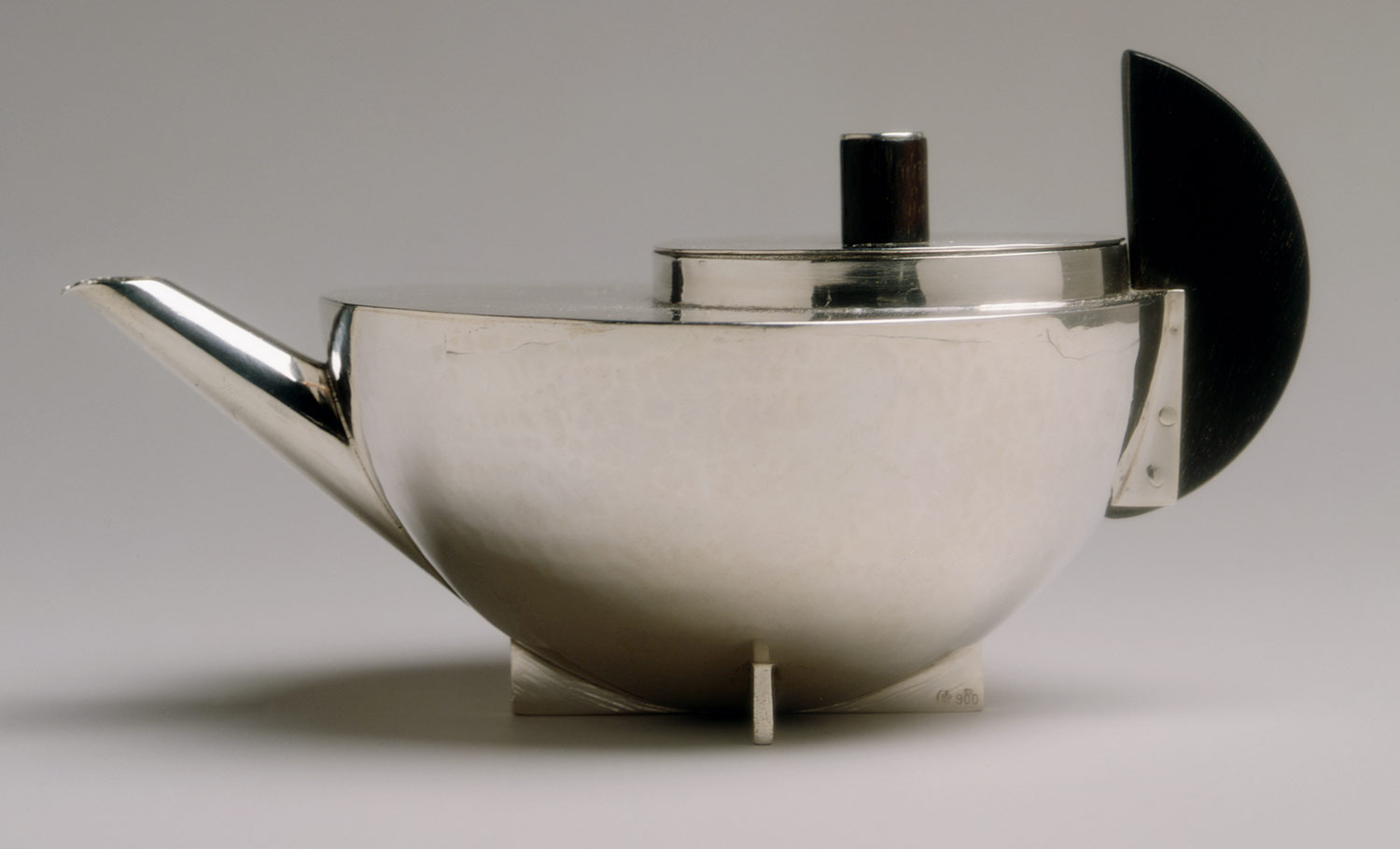
Tea infuser and strainer - Marianne Brandt


Even though it was founded in 1919, the influence of the Bauhaus can still be seen in today's design world; one of these being the fashion industry The images below show pieces from the Autumn/Winter 2014/2015 collections by renowned fashion houses Givenchy and Prada. 

For example, the tailored mens' suits in the Givenchy collections all have neutral or colourful banding at the pockets of the trousers. Miuccia Prada opts to design womens' dresses using bold prints and bright colours. 


Prada collection Autumn/Winter 2014/2015


Givenchy collection Autumn/Winter 2014/2015

References

Covert, A. (2015). 8 Beautiful Products of Bauhaus: The Single Most Influential School of Design. [online] Gizmodo. Available at: http://gizmodo.com/5918142/8-beautiful-things-from-bauhaus-the-single-most-influential-school-of-design [Accessed 18 Dec. 2014].

Metmuseum.org, (2015). The Bauhaus, 1919–1933 | Thematic Essay | Heilbrunn Timeline of Art History | The Metropolitan Museum of Art. [online] Available at: http://www.metmuseum.org/toah/hd/bauh/hd_bauh.htm [Accessed 18 Dec. 2014].

Moma.org, (2015). MoMA - Explore Bauhaus. [online] Available at: http://www.moma.org/interactives/exhibitions/2009/bauhaus/Main.html [Accessed 18 Dec. 2014].

Ross, S. (2009). Bauhaus: Ninety Years of Inspiration - Smashing Magazine. [online] Smashing Magazine. Available at: http://www.smashingmagazine.com/2009/08/02/bauhaus-ninety-years-of-inspiration/ [Accessed 18 Dec. 2014].

style.com, (2015). Givenchy Fall 2014 Menswear - Collection - Gallery - Style.com. [online] Available at: http://www.style.com/slideshows/fashion-shows/fall-2014-menswear/givenchy/collection/52 [Accessed 18 Dec. 2014].

style.com, (2015). Givenchy Fall 2014 Ready-to-Wear Fashion Show: Runway Review - Style.com. [online] Available at: http://www.style.com/fashion-shows/fall-2014-ready-to-wear/givenchy [Accessed 18 Dec. 2014].

The Cut, (2015). Prada. [online] Available at: http://nymag.com/thecut/runway/2014/fall/milan/rtw/prada/33/ [Accessed 18 Dec. 2014].

Vogue.com.au, (2015). The new Bauhaus gallery. [online] Available at: http://www.vogue.com.au/fashion/trends/galleries/the+new+bauhaus,31363?pos=0 [Accessed 18 Dec. 2014].