Thursday 19 December 2013

'Spectacular Spectacular' - Moulin Rouge and its costumes

Being into music, without a doubt, one of the films that I just had to watch was Moulin Rouge. I thank the heavens that I did so at the beginning of our school semester since once presented with our assignment for film, I immediately thought of this particular film and it's wonderful costumes, especially those pertaining to the main female character. That was part of the main inspiration for my concept - designing a classy yet modern evening gown.


Moulin Rouge is a 2001 Australian-American romantic pastiche-jukebox musical film directed, produced and also co-written by Baz Luhrmann. Featuring the talents of the stunning Nicole Kidman (Satine) and Ewan McGregor (Christian), it tells the story of a young English man (McGregor) who travelled to Paris in the year 1899 to become a writer and make part of Montmartre's Bohemian movement. After accidentally meeting artist Toulouse-Lautrec and his fellow performers, he helps them finish their show 'Spectacular Spectacular' in the hope of selling it to Harold Zidler, owner of the Moulin Rouge. Christian is set to meet Satine (Kidman), the star courtesan of the cabaret. At the same time, Zidler is making arrangements with the wealthy Duke of Monroth, a potential investor in the cabaret. Satine mistakes Christian for the Duke, but soon learns that Christian is just a writer - though that didn't stop them from falling in love. After a series of events the Duke soon realises that the play is a metaphor for the love triangle consisting of Christian, Satine and the Duke himself, and demands a change in ending. The Duke warns Zidler that he will have Christian killed if Satine is not his. When Zidler informs Satine that she is dying, she tells Christian that they can no longer see each other because she will be staying with the Duke. Christian becomes depressed, and on the night of the show, he sneaks back into the Moulin Rouge. Suddenly finding himself in the spotlight, Christian pretends to be an actor, and finally walks off the stage in anger, only to return as Satine begins to sing the song Christian had previously written to express their love for each other. The Duke and his bodyguards try to kill Christian, but both attempts fail. As the show ends and the curtain closes, Satine succumbs to her illness, whose last words affirm her love towards Christian. The film ends with Christian at his typewriter a year later - 1990 - writing the tale of the two lovers. 

Costume design is essential in any film, together with the script, actors and soundtrack. Though probably on a subconscious level, the costumes determine how the audience portrays the characters that wear them. Through powerful colours and sparkling accessories, the audience may come to know of the character's role in the film as being central, while being part of the background when characters are seen in less varying costumes. It is worth noting that this film won an Oscar for Best Costume Design, and it was well-deserved in my opinion seeing as the level of creativity shown by the main costume designer Catherine Martin is of extremely high level. For me, she succeeded in giving the audience a glimpse of real people and theatre characters in the 1900s while also modifying them and giving the audience a more modern view. Particular attention must be paid to the costumes worn by lead actress Nicole Kidman. In an interview with national British newspaper The Guardian, Martin says:

"With Satine, we needed to make it clear that this is the most beautiful woman in Paris. Admittedly, Nicole is already very beautiful, but she may not be everybody's idea of ideal beauty, so we needed to make it clear with the costumes' signs and symbols that that's who she was. We looked to Hollywood's glamour heroines like Marlene Dietrich, Marilyn Monroe, Greta Garbo - all sexually available to the men in the movies but emotionally very unavailable, and we looked at how that manifested itself in their clothing. Their wardrobes tended to be very graphic, unfussy, dramatic in their colour choice. We then used that." 
(Martin, 2001)

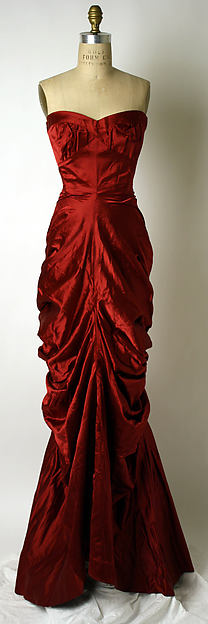
There are two particular costumes which struck me most - the first being the Red Dress, also known as the "Smoldering Temptress" Dress.
.


As one can see from the above costume designs, Satine's iconic Red Dress went through various before it arrived at the one used in the film. Made of red satin, with a corseted top that laces in the back and an intricate bustle, the dress is perhaps the most famous from the film. The colour of the dress was cleverly chosen to reflect Satine's character in the scene, primarily because it draws attention to her, and it also reflects her attempt at softening the Duke to invest in the show.

The second costume which I will probably use as a reference point in my design process is the Gothic Tower Dress. With reference to accessories, it is worth noting the necklace used in this scene.


The dress is made entirely of  black velvet, trimmed with reddish-brown fur along the train and the one shoulder. It is a pity that this detail is barely noticeable due to the minimal lighting used in the scene so as to reflect the unsettling atmosphere in the scene. The necklace worn by the actress was designed by Stefano Canturi and consisted of 1, 308 real diamonds and platinum, and was the most expensive piece of jewellery ever specifically made for a film. 

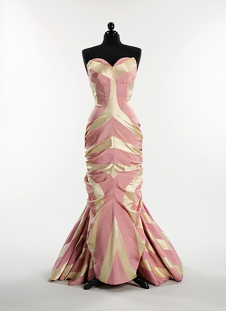
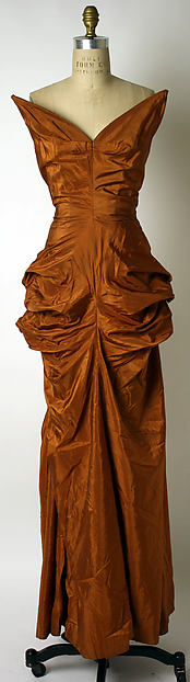
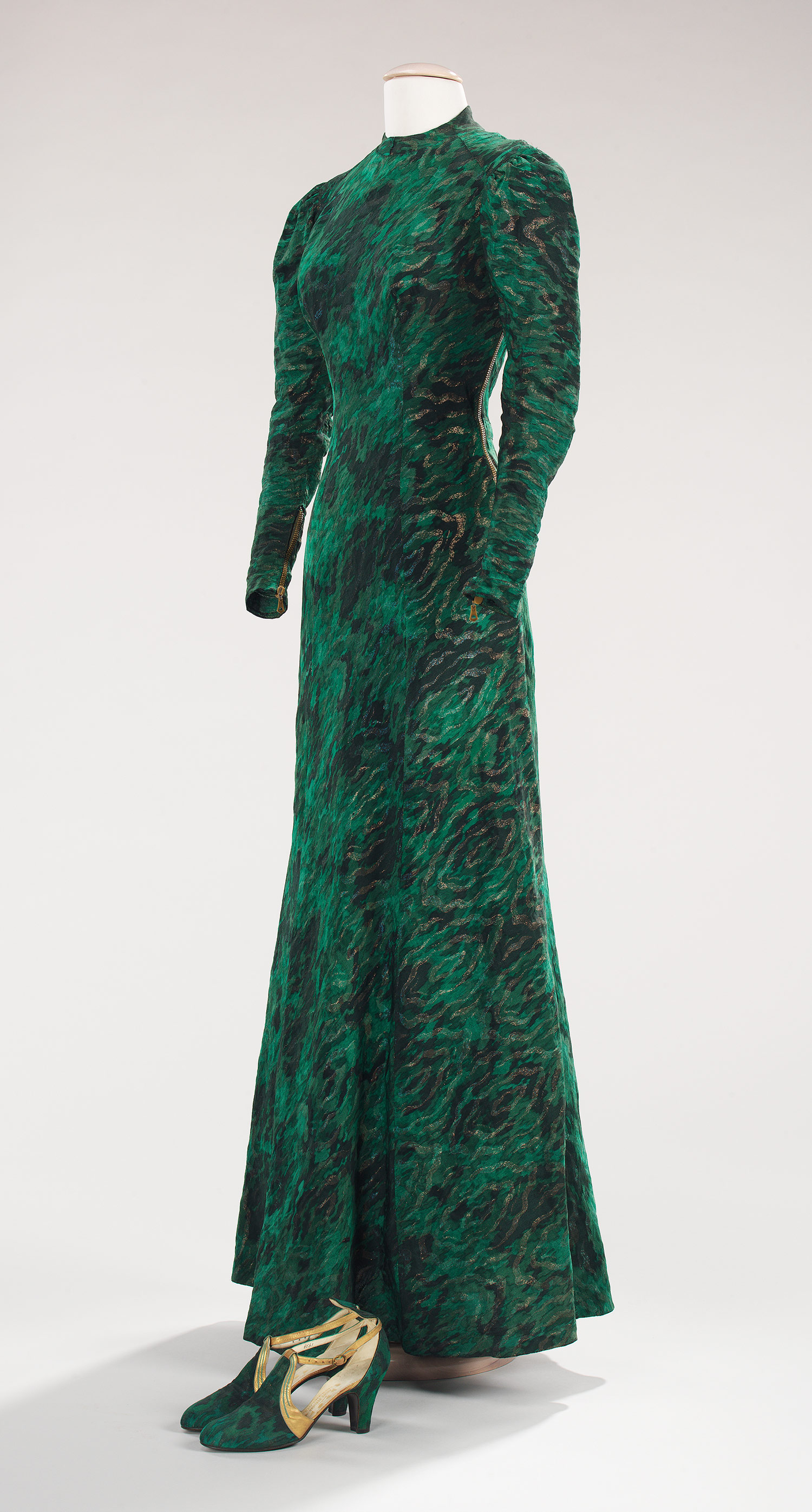
I couldn't help but add some more images of costumes from this film. To me, each one is a magnificent piece of art. 


References:

IMDb. Moulin Rouge! (2001) [online]. Available at <http://www.imdb.com/title/tt0203009/?ref_=ttfc_fc_tt> [Accessed 19th December, 2013]

Hadley Freeman, 2001. Can-can do [online]. Available at <http://www.theguardian.com/film/2001/sep/07/fashion> [Accessed 19th December, 2013]


Video Source:

https://www.youtube.com/watch?feature=player_embedded&v=MANzKbDuNw8


Image sources:

http://www.costumersguide.com/moulinrouge/ref17.jpg

http://www.costumersguide.com/moulinrouge/ref20.jpg

https://blogger.googleusercontent.com/img/b/R29vZ2xl/AVvXsEha9Jp4EWWsTMGPNFbO106WbNsGqdUVytQdkH734QJ3hMOZaybsK7E_8Ano_wJCmGF9Dfz7T3RTe-tVDyt1gjDDsGGgjPAXUQoiUunwC4Ht3y8wyOlFVt96h4WsAuC_NeM5PfPTSNJaNcKm/s400/mcx-top-movie-dresses-moulin-rouge-xln.jpg

http://www.costumersguide.com/moulinrouge/gothic5.jpg

https://blogger.googleusercontent.com/img/b/R29vZ2xl/AVvXsEh3AdpmV6oqbpblFy2gfb9Hjn34iEfzBd01E80Zau9IvlxbpS4bEkZveuvif2jHuWllA8HPzubWp16QWomDXVcpaq4dE_kyM9dzU4H4mH2vpq1jaYEHu4LjbB-yE1LbqtJ-UXSsTp1zywqL/s400/gothic2.jpg

https://blogger.googleusercontent.com/img/b/R29vZ2xl/AVvXsEiha29_OT7M-Srocdy9s0VomQFNfqo50lPBzR2Io2woCL2TiGXEm1mus0JHiWpUmsfV1_6bXPbRST9eSLTs3jSwkiEIWFcaMECb5iNMzxqNqsPUBHZR1hKmghjp3vVvQYfIWSBRgI3y-9if/s400/2013-05-07+07.17.45+pm.png

http://www.costumersguide.com/moulinrouge/black1.jpg

http://insightandout.files.wordpress.com/2011/10/moulin-rouge-nicole-kidman.png

http://www.costumersguide.com/moulinrouge/corset1.jpg

https://blogger.googleusercontent.com/img/b/R29vZ2xl/AVvXsEjxXoHLmImsHNJwFXG0AOvO53q1d8zYXttz3Fd4t3D5qf824xXFi9fQuk5vi0cvIPe2Sdyj6Ub0Hk02CidHUWXfvaYY5VdTuW0DLbictWyBAJ-zWlO5tXIiYM5MrQwgcxFryy5QwzStC_Ox/s400/2013-05-07+07.14.59+pm.png

http://bios.weddingbee.com/pics/127250/satineweddingdress1.jpg

http://www.costumersguide.com/moulinrouge/hindi9.jpg

Monday 16 December 2013

(Original) Elsa Schiaparelli - "that Italian artist who makes clothes"

The main idea for my visual concept is to design an evening gown with a twist, in that I want it to be elegant and classy yet modern. As I was conducting research for my previous blog posts, I came across a designer who was influenced by the Futurist movement - one of the avante-garde movements of the early 20th century which focused on dynamism, movement and modernity. I am talking about none other than Elsa Schiaparelli. My main aim is to focus on recreating a similar dress structure to that designed by the mentioned designer and also to be inspired by the patterns and colours she used in her designs.

"that Italian artist who makes clothes"
(Coco Chanel, n.d.)

Those were the words used by famous rival fashion designer Coco Chanel to describe Elsa Schiaparelli. Born in Rome in 1890 in an aristocratic family, Elsa showed signs of the need for personal freedom from a very young age - an aspect which would show up in her work later on. Living life with a certain amount of luxury thanks to her parents' wealth and social status was considered a bonus - in the eyes of others. On the contrary, she believed that luxury was stifling to her art and creativity, thus leading to her moving to New York City and later on to Paris. It was in 1927 that Shiaparelli began to design and make clothes with the encouragement of Paul Poiret, and later in that same year she started her own business.

Her first collection consisted of sweaters adorned with surrealist trompe l'oeil images - a theme that was to become Schiaparelli's trademark. It consisted of a black sweater with a white trompe l'oeil scarf at the neck. which was a particular success and was selected to appear in French Vogue. She then moved on to produce a collection named Pour le Sport, including clothing such as bathing suits, skiwear and linen dresses. She also created the revolutionary divided skirt. In 1931, Schiaparelli added evening-wear to her repertoire, strengthening her business further. Collaborating with Surrealist artist Salvador Dali on famous pieces such as the Shoe Hat, the Tears dress and the skeleton dress increased her fame not just in her time but also today.


Schiaparelli is known for introducing many styles and techniques into the history of fashion such as the creation of zippers in colours that matched the the rest of the clothing, introducing brooch-like buttons to adorn clothes, and also her association with a shade of magenta - which came to be known as "Schiaparelli pink". In her autobiography Schiaparelli explained that her fascination with the colour came from a Cartier diamond owned by her friend. She describes the jewel's colour as "bright, impossible, impudent, becoming, life-giving [...] a shocking colour, pure and undiluted."

She returned to France after spending the war period in New York, only to find that the fashion styles have changed and she struggled to compete with Christian Dior's post-war 'New Look'. The doors of the House of Schiaparelli - her design house - closed in 1954. Despite this, she still remains one of the most influential and prominent figures in the fashion industry. Elsa Schiaparelli died in 1973.


As one can note from the images above, Elsa Schiaparelli was clearly interested in designing clothes that were form-fitting and which flattered the female form. She also opts for the streamlined silhouette, and forms that created some sort of shape and fluidity. I will definitely be opting for a similar style in my design for the dress.


References:

Vogue Style File - Elsa Schiaparelli (2012) [online]. Available at <http://www.vogue.co.uk/spy/celebrity-photos/2012/4/18/elsa-schiaparelli-style-file> [Accessed 16th December, 2013]

Reeder, Jan. "Elsa Schiaparelli (1890–1973)" [online]. Available at <http://www.metmuseum.org/toah/hd/elsa/hd_elsa.htm> [Accessed 16th December, 2013]


Image sources:

http://collections.vam.ac.uk/item/O15655/cravat-jumper-elsa-schiaparelli/

http://www.metmuseum.org/Collections/search-the-collections/105737?rpp=20&pg=2&ao=on&ft=elsa+schiaparelli&what=Evening+dresses&pos=23

http://www.metmuseum.org/Collections/search-the-collections/105736?rpp=20&pg=2&ao=on&ft=elsa+schiaparelli&what=Evening+dresses&pos=22

http://www.metmuseum.org/Collections/search-the-collections/157803?rpp=20&pg=1&ao=on&ft=elsa+schiaparelli&what=Evening+dresses&pos=17

http://www.metmuseum.org/collections/search-the-collections/156222?img=0

https://www.metmuseum.org/toah/works-of-art/2009.300.1168a-c

Sunday 15 December 2013

Futurism. Colours. Movement.

After giving it some thought, I came up with a general idea for my visual concept, that is, to design an evening gown with a twist, in that I want it to be elegant and classy yet modern, inspired by the designs of Italian-born French couturière Elsa Schiaparelli. While conducting research regarding the mentioned designer, I found out that despite being greatly associated with the Surrealist and Dadaist movements, she was also influenced by the Futurists. That is why I decided that with regards to art, I would refer to the Futurist movement - focusing mainly on their use of colour, since that is the aspect which will be used as a source of inspiration for my design. 

Futurism was an artistic and social movement that originated in Italy in the early 20th century. It was founded by the Italian poet Filippo Tommaso Marinetti who published his Manifesto of Futurism on the front page of Le Figaro - a Parisian newspaper. The movement was mainly based in Italy, although its influences reached out also to Russia and England, with key figures of the movement including Italian artists Filippo Tommaso Marinetti, Umberto Boccioni and Giacomo Balla, and Russian artist Natalia Goncharova.

It is fascinating to note that the Futurists made use of every artistic form possible to demonstrate their beliefs: painting, sculpture, industrial design, theatre, fashion, film, literature, music, architecture and graphic design amongst others. 

Being mostly based in Italy, the main aim of the Futurist movement was to rid the country of anything old, classical and not totally new and work towards a new, modern Italy. They felt that the past culture of Italy was weighing them down as it was particularly oppressive. That is why Marinetti states in one his Manifesto that the Futurists "will free Italy from her innumerable museums which cover her like countless cemeteries" (Marinetti,1909). What the Futurists proposed instead was the introduction of modernity. They emphasized and celebrated anything related to the modern world of industry and technology - speed, youth and violence; and objects such as the car, the aeroplane and the industrial city. 

We declare … a new beauty, the beauty of speed. A racing motor car … is more beautiful than the Victory of Samothrace’
 (Marinetti, 1909) 

With regards to art, the Futurists incorporated elements of Neo-Impressionism and Cubism to create an original style that expressed the dynamism, energy and movement of modern life. Their art is distinctive in that most of the time they made use of a process known as divisionism, which meant that they broke light and colour down into a series of dots and geometric forms.

Sea = Dancer
(1914)
Gino Severini

 Abstract Speed + Sound
 (1913–1914)
Giacomo Balla

The City Rises
(1910)
Umberto Boccioni

While looking for more contemporary examples of art inspired by the futurist movement, I came across the art work (shown below) by Mark Webster. Comparing the works shown above with the one below, one can immediately notice the aggressive use of line and simple but bold colours. 

Abstract Geometric Futurist Figurative Oil Painting
Mark Webster


I will definitely be making use of a combination of these colours in my design and further enhancing the aspect of movement by including lines and shapes in subtle but effective way. 


References:

TATE - Futurism [online]. Available at <http://www.tate.org.uk/whats-on/tate-modern/exhibition/futurism> [Accessed 15th December, 2013]

The Solomon R. Guggenheim Foundation (SRGF), 2013. Collection Online - Futurism [online]. Available at <http://www.guggenheim.org/new-york/collections/collection-online/movements/195215/description> [Accessed 15th December, 2013]


Image sources: 

http://upload.wikimedia.org/wikipedia/commons/f/fe/Umberto_Boccioni_001.jpg

http://upload.wikimedia.org/wikipedia/en/1/12/GBallaArt.jpg

http://markadamwebster.com/workszoom/897562

http://www.designishistory.com/files/gimgs/32_futurism01.jpg


Monday 28 October 2013

Sherlock Holmes (2009) - The opening scene and the first fight scene

Is it the soundtrack, action or excellent acting skills that make me want to see this film over and over again? I don't know. What I do know is that Sherlock Holmes, directed by Guy Ritchie and featuring the talents of Robert Downey Jr. and Jude Law, has become one of my all-time favourite films. In this post I will be discussing the first two-and-a-half minutes of the film. 


The opening scene of the film starts with cobbled streets - a key feature in London during the 18th century - which immediately sets the scene. The track 'Discombobulate' composed for the film by Hans Zimmer begins to play which sounds dramatic yet slow, however begins to build up. The camera moves upwards in a follow shot of a horse and carriage; the sound of the clomping horse hooves momentarily dominates the soundtrack. Soon after we notice and increase in camera movement as the camera moves towards the carriage and zooms inside. This increase in speed mimics the speed of the carriage and this ultimately generates a sense of urgency and movement. After several close-up shots of the weapons being handled by two male characters, we are introduced to a man running, as though he is a suspect and the carriage is following him. Through a close-up shot, the camera then reveals that the man is the protagonist. Soon after, a voice-over is used as the leading character stands against a wall in a building as he contemplates his next moves. This attack scene is in slow motion and the music is muted. The scene then flashes forward to when he leaps out and attacks a man using the fight moves stated in the voice-over. The scene ends with the protagonist taking his attacker's hat and swiftly descending a spiral staircase.

Emphasis on movement in this scene is created through the use of music, slow motion and contrasting brisk camera movements in certain moments, and close-up shots. 


References:

IMDb. Sherlock Holmes (2009) [online]. Available at <http://www.imdb.com/title/tt0988045/> [Accessed 28th October, 2013]

Image source:

http://2.bp.blogspot.com/MSaOPLoLR3w/Tu6JwQTrqpI/AAAAAAAACMc/9WEqiLhPF4g/s400/zz+fighting+ring+sherlock_holmes50.jpg

Video sources:

http://www.youtube.com/watch?v=098QxdbedQI&list=PL0BD4DDEDB4BC7E80

http://www.youtube.com/watch?v=XSc_pRWkegg&list=PL0BD4DDEDB4BC7E80


Battleship Potemkin - the 'Odessa Steps' scene

Battleship Potemkin is a 1925 silent film directed by Sergei Eisenstein. It presents a dramatized version of the mutiny that occurred in 1905 when the crew of the Russian battleship Potemkin rebelled against their officers of the Tsarist regime. 


The most celebrated scene in the film is the massacre of civilians on the Odessa Steps. This scene has been described as one of the most influential in the history of cinema, because it introduced concepts of film editing and montage to cinema. 

In this scene, the audience experiences emotional intensity through movement and editing. Once can notice the close-ups of the people rushing chaotically down the steps as they see the soldiers marching down towards them. The implication of rushing movement is also shown through the long shots of the same scene. The chaotic movement is superseded by the soldiers rhythmically marching down the steps. The effect is also enhanced by the increase in tempo and the accelerated rhythm of the music. There is a reversal of the downward movement and this is seen by the slow and solemn movement of the woman as she carries her dead child up the stairs towards the soldiers. Once the woman is shot, the focus goes back on the crowd rushing downwards. The scene ends with a slight increase in rhythm and tempo as the focus becomes the baby's carriage rolling down the steps amidst the fleeing crowd.


A wide shot of the massacre on the 'Odessa Steps'


The boots of the soldiers shown
marching down the 'Odessa Steps'


A baby in a carriage falling down the 'Odessa Steps'


References:

Micheal McVey, 2010. Montage and Juxtaposition in “Battleship Potemkin” – Odessa Steps Sequence [online] Available at <http://skiffleboom.wordpress.com/2010/05/06/montage-and-juxtaposition-in-%E2%80%9Cbattleship-potemkin%E2%80%9D-%E2%80%93-odessa-steps%C2%A0sequence%C2%A0from%C2%A0michael%C2%A0mcvey-skiffleboom-com/> [Accessed 28th October, 2013]


Image sources:

http://upload.wikimedia.org/wikipedia/commons/6/67/Potemkinmarch.jpg

http://upload.wikimedia.org/wikipedia/commons/e/e2/Odessastepsboots.jpg

http://upload.wikimedia.org/wikipedia/commons/0/0b/Odessastepsbaby.jpg


Video source:

http://www.youtube.com/watch?v=Ps-v-kZzfec

Sunday 27 October 2013

Movement in Futurist Fashion Design

Futurism was an avant-garde movement which originated in Italy in the 20th Century by the Italian poet Filippo Tommaso Marinetti. The main aim of the Futurists was to destroy older forms of culture and demonstrate the beauty of modern life. They practised in every art form - be it paintings, sculptures, graphic design and fashion amongst others. Whatever the medium, their aim was to emphasize themes associated with contemporary concepts of the future, including speed, technology, youth and violence. 


Considered the father of Futurist fashion, Giacomo Balla began designing textiles and suits in 1912/1913. With asymmetrical cuts and diagonal surface patterns, the brightly coloured outfits were a direct translation of the dynamic "force-lines" of his painted canvases. The Futurists were aggressively against clothing with frivolous detail, expensive fabrics and furthermore, class distinction in dress. Instead they promoted clothing designed in sleek lines and simple shapes which promoted the unencumbered movement of the human body, and the fast-paced rhythm of modern life as was evoked by dynamic textile designs and asymmetrical cuts.


With regards to colour, the Futurists despised the half-tone murky colours, and this can be seen in the way they chose their colours. They opted for bold and brightly intense colours in alarming combinations. This shocking choice of colours was done on purpose so as to unsettle traditional tastes in clothing. 


One can also note the dynamic designs in cut and texture to accompany the vibrancy of colour of the clothing. Asymmetrical and energized patterns consisting of shapes such as triangles, cones and circles were used since they believed that clothing in these designs integrated the sensations of movement and thus reflect the energy of a new urban society. 


References:

Leila Hartly,2010. Futurist Fashion [online]. Available at <http://leilahartley.wordpress.com/2010/10/24/futurist-fashion/ > [Accessed 27th October, 2013]

College Arts Association, Emily Braun. Futurist Fashion: Three Manifestoes [online]. Available at <http://historytransformationofdesign.weebly.com/uploads/1/1/7/2/11722228/futurist_fashion.pdf > [Accessed 27th October, 2013]

http://etd.lib.fsu.edu/theses_1/available/etd-04132004-000259/unrestricted/02_alm_text.pdf (no information available) [Accessed 27th October, 2013]

Images source: http://flommus.tumblr.com/page/241

Movement in Duchamp's 'Nude Descending the Staircase, No.2'

Marcel Duchamp (1887-1968) was a French-American painter and mixed media artist who is best known today as being one of the most influential figures of modern art. Despite not being in alliance with any of the movements, Duchamp was associated with and greatly influenced by Cubism, Dadaism and Surrealism. His art sought to engage the intellect and imagination of the viewer instead of just the eyes - portraying invisible worlds instead of just visible ones. His aim was to introduce the fact that art can be about ideas and not just about worldly things. Duchamp refused to give in to the rules of an established art system, and this can be seen in his works which are characterized by their humour, the variety and unconventionality of the media used and most importantly the incessant probing of the boundaries of art. It is this 'new art' which makes Marcel Duchamp one of the artists in the history of art who has had the most impact on artists many centuries later. 


Nude Descending Staircase, No.2
(1912)

Nude Descending Staircase, No.2 is one of Duchamp's paintings which caused quite a stir when it was presented since it depicted a mechanical portrayal of a subject which was once so sensual and classical. Instead of capturing the woman restricted to the confines of the bedroom, Duchamp records the entire process of the woman coming down the stairs. 

In this oil painting, one can see the influences of Cubism and Futurism. The former can seen through the deconstruction of forms and monochromatic tonality which were major characteristics of the Cubist movement. The latter is seen in the way that Duchamp doesn't immortalise a single pose or gesture, but he captures the motion and energy of the body as it moves by painting each static phase (like the Futurists who were obsessed with notions of velocity). 

Essentially, the painting is made up of abstract lines and planes, but they are assembled in such a way so as to suggest rhythm and convey the movement of the figure. The dark outlines show the contours of the body while also emphasizing the dynamics of the moving figure by acting as motion lines. There are also some accented arcs made up of dotted lines which suggest the thrusting pelvic motion. Despite being monochromatic, the use of tones and shades of the ochres and browns in the painting are also essential in depicting movement. The colour seems to be fairly darker at the upper left corner than the centre and bottom right corner of the painting. This was probably done to show the initial movement - an action which occurred previous to the ones that followed. The shaded planes also help to give depth and volume to the form. 


References:

Andrew Stafford, 2008. Making Sense of Marcel Duchamp [online]. Available at <http://www.understandingduchamp.com/> [Accessed 26th October, 2013]

Terry Riggs, 1997. TATE - Marcel Duchamp [online]. Available at <http://www.tate.org.uk/art/artists/marcel-duchamp-1036> [Accessed 26th October, 2013]

MoMa, 2013. The Collection - Marcel Duchamp [online]. Available at <http://www.moma.org/collection/browse_results.php?artistFilterInitial=&criteria=O%3AAD%3AE%3A1634&page_number=1&template_id=6&sort_order=1> [Accessed 26th October, 2013]

The Solomon R. Guggenheim Foundation (SRGF), 2013. Collection Online - Marcel Duchamp [online]. Available at <http://www.guggenheim.org/new-york/collections/collection-online/artists/bios/1174> [Accessed 26th October, 2013]

Image source: http://upload.wikimedia.org/wikipedia/en/c/c0/Duchamp_-_Nude_Descending_a_Staircase.jpg


Saturday 26 October 2013

Movement in Muybridge's 'Horse in Motion'

Eadweard Muybridge (1830-1904) was a British photographer whose early photographic experiments laid the foundation for modern cinema, making him known today as 'the father of the motion picture'. In 1860 Muybridge developed a keen interest in photography, but it was in 1872 when he started to consider rapid motion photography after being approached by a Californian racehorse owner, Leland Stanford. It seemed that Stanford had made a bet on the issue as to whether all four feet of a horse were off the ground at the same time while trotting. His initial results did prove that Stanford was right, but it took another series of experiments (the result of which came to be known as the first ever moving picture) and his invention of the zoopraxiscope (a device which enabled him to project his silhouettes in rapid succession onto a screen) to lead the way to further develop his studies of motion and in-motion projection.  

The Horse in Motion
(1878)

The experiment mentioned previously is known as The Horse in Motion, also known as Sallie Gardner at a Gallop. It is a series of photographs shot in rapid succession - capturing what no human eye had ever seen: that a horse lifts all four hooves off the ground at one point in the action of running. This experiment was conducted after Muybridge, who was a pioneer not only of early photography but the science and study of movement as well, fabricated a special camera that would capture every sequence of his subjects' movements, frame by frame. By getting a horse to trigger the shutters of a bank fitted with twelve cameras, Muybridge was able to capture each movement in the process of the horse's galloping. When run together, the photographs produced the effect of a horse in motion. 


References:
WildFilmHistory. Eadweard Muybridge [online]. Available at <http://www.wildfilmhistory.org/person/180/Eadweard+Muybridge.html > [Accessed 26th October, 2013]

TATE - Eadweard Muybridge [online]. Available at <http://www.tate.org.uk/whats-on/tate-britain/exhibition/eadweard-muybridge> [Accessed 26th October, 2013]

MoMa, 2013. The Collection - Eadweard Muybridge [online]. Available at <http://www.moma.org/collection/browse_results.php?criteria=O%3AAD%3AE%3A4192&page_number=2&template_id=6&sort_order=1 > [Accessed 26th October, 2013]

Image source: http://upload.wikimedia.org/wikipedia/commons/7/73/The_Horse_in_Motion.jpg


Movement in Cassandre's 'Dubo Dubon Dubonnet'

French-Ukrainian painter, lithographer and visual savant Adolphe Jean-Marie Mouron, better known as A. M. Cassandre (1901-1968), is one of most well-known and influential graphic designers in history. He is best known for his posters depicting objects which are made to stand out through the use of bold geometry and witty pictorial drama. Cassandre's work is generally Art Deco, though in some of his work we can see the influence of styles such as Cubism and Futurism. The philosophy behind his work was a simple one: telling a story through a poster by using simplistic design and block letters so that even the common man on the street could understand it. Cassandre was the first graphic designer to simplify his designs so that they could be read from fast moving vehicles, and also being the first to introduce the idea of serial posters - a group of posters to be seen in rapid succession to convey a complete idea.


Dubo Dubon Dubonnet
(1932)


Dubo Dubon Dubonnet is probably Cassandre's most famous work. He designed this three-part poster for the French aperitif 'Dubonnet' in 1932. It represents a man drinking the aperitif, depicted in three different stages in the form of a cinematic sequence, with the word DUBONNET placed under each panel. This in itself already shows motion. In the first panel, the man is looking at the glass. One can notice that the first image consists mainly of the outline of the figure. In the same way, the word DUBONNET is incomplete, with only DUBO shown in black. the next panel shows the progression of the man as he drinks; he is filled with colour and the words now show DUBON. The final panel depicts the man emptying the bottle, with the full name of the aperitif - DUBONNET - now showing. Cassandre's use of repetition evokes rhythm in the piece, with a sense of motion being created through the cinematic representation of the panels. One can also note the sweeping lines and forms used to convey movement, which allow the clarity and simplicity of the objects to work hand in hand with simplicity of the colour palette. Through this interplay of form, colour, words and picture, Cassandre was sure to capture the attention of all the passers-by that rushed around the city.


References:

Micheal Johnson. Cassandre: Art Deco Poster Designer [online]. Available at <http://arthistory.knoji.com/cassandre-art-deco-poster-designer/> [Accessed 28th October, 2013] 

Mickey Ross, 2012. A Flesh and Blood Recreation of the Famous Triptych “Dubo, Dubon, Dubonnet” [online]. Available at <http://rossartgroup.wordpress.com/2012/07/28/a-flesh-and-blood-recreation-of-dubo-dubon-dubonnet/ > [Accessed 28th October, 2013] 

Tannah Shukri, 2011. Art Deco and Artists [online]. Available at <http://tannahshukri-historyofdesign.blogspot.com/2011/12/art-deco-and-artists.html > [Accessed 28th October, 2013] 

Art Factory. Cassandre [online]. Available at <http://www.artyfactory.com/art_appreciation/graphic_designers/cassandre.htm> [Accessed 28th October, 2013] 

Stedelijk Museum Amsterdam, 2013. COLLECTION - A.M. CASSANDRE: DUBO, DUBON, DUBONNET, 1932 [online]. Available at <http://www.smcs.nl/en/artwork/8856-dubo-dubon-dubonnet> [Accessed 28th October, 2013] 

Image source: http://www.artyfactory.com/art_appreciation/graphic_designers/cassandre/dubo.jpg


Tuesday 15 October 2013

Changeling

Cinematography: camera movement, angles and shots


Let's face it: no matter how much we deny it, at some point or other we all gave in to the little voice in the back of our minds controlled by a little devil (or not) by the name of curiosity. Many a time have we watched a film purely based on an intriguing title. Well, that is exactly what happened to me this time round. 

Directed by Clint Eastwood and featuring the flawless talents of Angelina Jolie, Changeling is set in Los Angeles in 1928. The film, based on real events, is about a single mother - Christine Collins (Angelina Jolie) - who returns home from work one day to find that her five-year-old son Walter Griffith is missing. When she files in a report, the LAPD are not too eager to help a single mother. Five months later Christine is reunited with her son, only to find out that he is an imposter. When she points out that the child is not her son, Christine is faced with accusations that she is a liar, an unfit mother. Despite the effort of the police, a doctor and the boy himself to convince her, she continues to fight to find her real son. When she joins a minister in his public criticism of the police, she is sent to a psychopathic ward to silence her. Christine plans to show the LAPD for what they really were. She succeeds but still does not find Walter. Later she finds out that he was part of kidnapping and murder case, but he was one of the lucky ones to get away. This gave Christine hope to continue looking for Walter. In a nutshell, this film is a pure example of police corruption, female disempowerment, child endangerment and the consequences of violence. 

The emotion of the characters is essential to set the mood for each particular scene in the film, and this is effectively done through the camera shots and angles. 


For example, in the beginning of the film, when we can see the interaction between Christine and Walter, the camera angle is directed upwards, to show that the child really did look up to and love his mother. The same can be seen when the mother looks down to her son. The feelings of affection, warmth and love can be seen through the lighting used in these particular scenes. 


In other scene of the film, such as when Christine found out about her missing son and when she was taken to the psychopathic ward, the camera would zoom in on her face to show her tears and facial expressions so that the viewer could also feel the emotions along with the characters. 


The camera angles and choices also showed dominance between the LAPD and Christine. When the police and Christine were in the same scene together the cameras angle seemed to be an upward angle toward the police and a downward angle toward Christine to show the police had dominance over her and all other females.


With regards to camera movement, we can see they were not fast-paced unless it was a scene full of suspense. The camera angles and choice of shots were more slow and steady to show emotion and realism of the situation that was happening to Christine. 

In my opinion, Clint Eastwood did a brilliant job on the film since despite the effective, simplistic acting of the actors, the light and shadowing, scene selection and camera angles were excellent in capturing the attention and heart of critics and viewers alike. 


Monday 7 October 2013

Welcome

Hi all!

I am a twenty-year-old student at MCAST Art and Design. The main aim of this blog is to show my journey through the research, inspiration and design process. 

I hope that you'll find it interesting and I look forward to any comments that you might like to add.

Karen

:)